Feb 01, 2023
Driving Dynamic Excel Data Types with XLOOKUP and SUBTOTAL
Philip Wiest, Guest Blogger

Excel has clever ways of combining functions and features to do things.
How to create dynamic charts and switch source values using Excel's XLOOKUP function.
To do this, we’ll combine:
- SUBTOTAL
- XLOOKUP
- FIELDVALUE
to dynamically change the data type value displayed on a chart comparing the G7 countries.
- Canada
- France
- Germany
- Italy
- Japan
- United Kingdom
- United States
Excel Data Types
By configuring a cell as a certain data type, you can link the cell value to an online data source. With this connection set up, you can insert refreshable companion lookup columns beside your cell.
For example, if you had a list of countries, you could (by formatting the cell as a data type) display fields like population, State, Country Leader(s).
In Excel, when you begin typing a list of locations, Excel “suggests” you assign them to a data type.
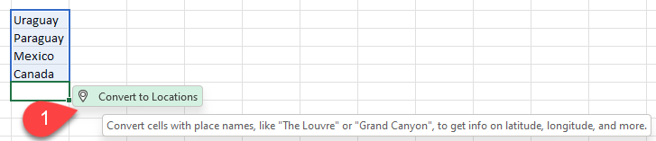
Whether or not Excel “suggests” a data type, you can always select the cells and assign a specific data type — Geography in this case.
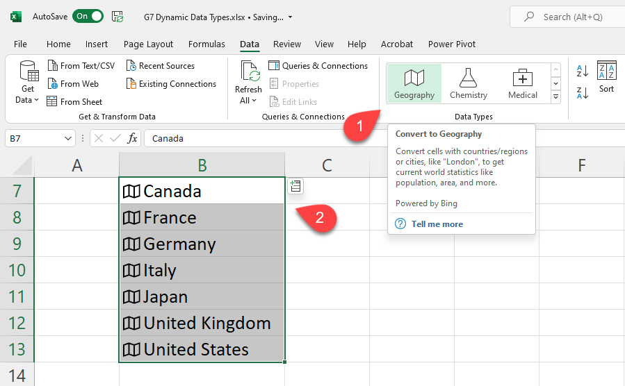
By assigning the Geography data type, you can expand your data with linked values — like population, area, CPI, et al.
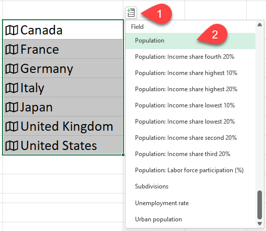
Whichever fields you choose, their names (like Population) are integral to building your slicer.
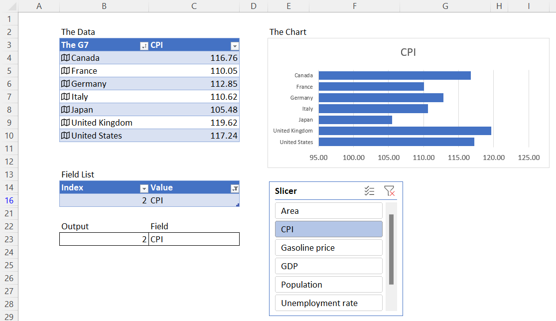
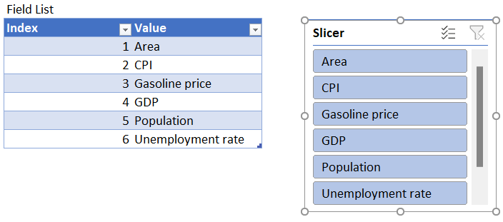
First, The Excel Table and Companion Slicer
You’ll need a list of potential columns to display, like Area, Gasoline, CPI, etc., and a row number beside each — all formatted as a table with a slicer.
To do this:
- Write a list of field names
- Place numbers beside each item
- Format the array as a table
- Add a slicer for the field names column
Excel SUBTOTAL and XLOOKUP
Now, when you click any item on the slicer, the table will collapse and display one row. You’ll need to calculate the row number and the value name by using SUBTOTAL and XLOOKUP.
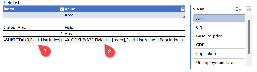
SUBTOTAL
In an empty cell, use the SUBTOTAL function to return the row of the selected slicer value.
XLOOKUP
In an empty cell, use the XLOOKUP function to look up the name corresponding to the number returned by the choice made on the slicer.
Field_List[Value],"Population")
SkillTip: XLOOKUP supplies an argument for “if not found.” In this example, I’ve used “Population” as the default value.
FIELDVALUE
The last ingredient in this creation is FIELDVALUE which combines a cell value with the field name returned by your slicer to display a field associated with the country.
If you study the sample formula,
It becomes
Where Canada comes from cell B4, and the word “Area” comes from cell C23 — the result of the XLOOKUP calculation.
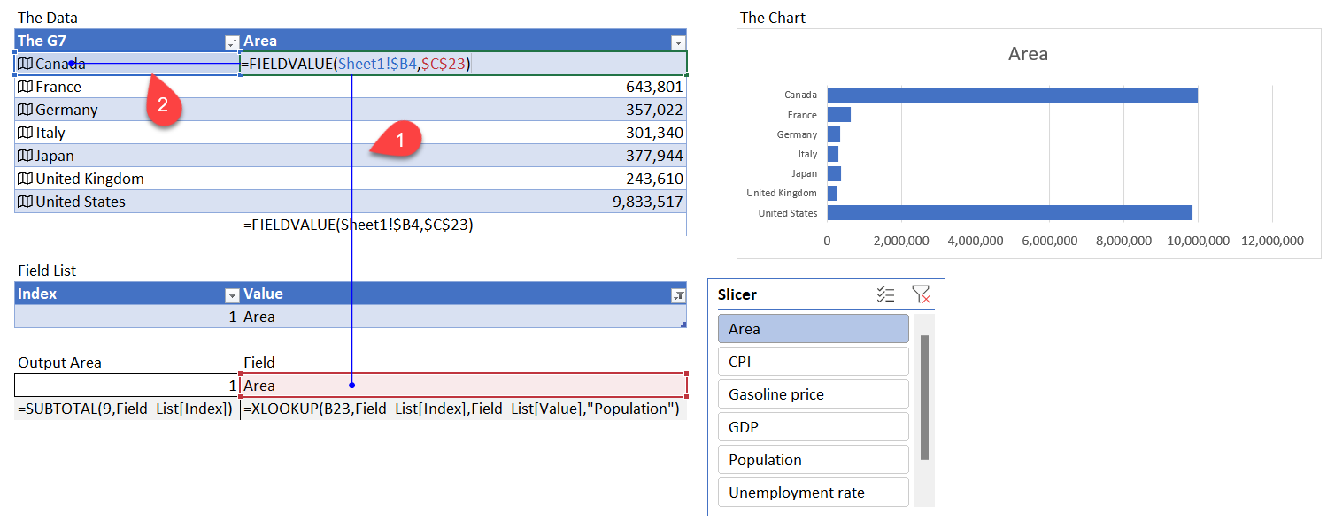
The Chart
With the formula copied to the other countries in the G7, you can create a bar chart beside it (Insert > Chart) and configure it as needed.
The Result
With these interconnected elements:
- The user selects one of the items on the slicer (e.g., Gasoline price)
- The Field List table is filtered to one row (Row 3)
- The SUBTOTAL function calculates the index number (3)
- The XLOOKUP looks up the Field Name in the second column of the table (Gasoline price)
- The FIELDVALUES formula beside the Country column uses the name selected by XLOOKUP
These steps will supply the data for your chart, and should appear as so:
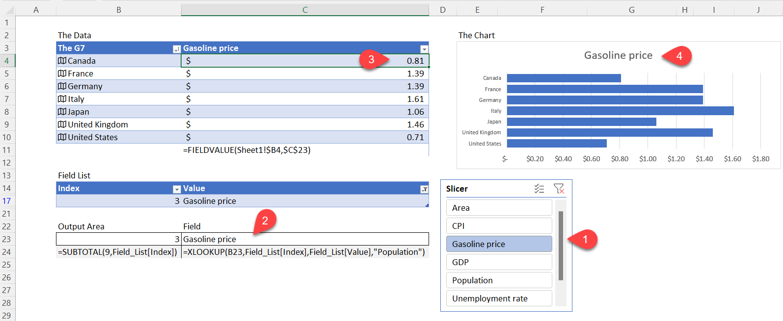
I’m sure the G7 have never looked at Gasoline prices like this, but with SUBTOTAL, XLOOKUP, and FIELDVALUES, they can!
Ready to learn more? Check out some of SkillPath’s live virtual training programs, on-demand video training or get it all with our unlimited eLearning platform.
Philip Wiest
Guest Blogger
Philip Wiest is an expert software trainer, computer analyst and database consultant who knows both the intricacies of computer systems and the ways today’s professionals need to use these essential business tools. Using his experience in Microsoft Excel and Microsoft Office, as well as Windows and the Internet, Phil uses a special mix of tactful guidance and distilled observation so his audiences learn and retain the critical keystrokes, application combinations and creative processes that save time and simplify computer use.
Latest Articles
Article Topics